
The brief
Freecharge Business is how 300,000+ merchants across India take payments by UPI, cards and wallets. Most are kirana stores and small retailers in Tier 2 and Tier 3 cities, on ₹10,000–15,000 Android phones, at a counter with a customer waiting.
Axis Bank owned Freecharge to win customers: every merchant was a future current account, and in time a loan priced on their own payments. With Paytm and PhonePe serving more than 17 million merchants each, Freecharge could not win on reach. The home screen had to move the merchants it had further along.
- Day 1
Set up QR
Nothing else works until a merchant can be paid.
- Day 1
Take payments
Every payment adds to a record of the business.
- Day 20
See the money land
Settlement becomes the question asked most.
- Later
Open a current account
The first product from the parent bank.
- Later
Borrow on your takings
Offered once the payment record qualifies.
That gave one screen two jobs. On day one, get a new merchant set up and paid. By day twenty, answer the question they ask dozens of times a day: has my money arrived? So I designed a home screen that changes shape as the merchant does.


A merchant who has not taken a payment yet. Setup QR leads the screen, the products explain themselves, and help is one tap away.
The same merchant, three weeks in. The question now is whether the money arrived, so transactions and settlements take the top, along with when the next settlement lands and what it will cost.
What we learned
A six-week, data-informed sprint. Funnel analytics identified the high-friction steps (bank account linking above all), which we then validated through on-ground interviews with merchants in Gurgaon, Haryana and Uttar Pradesh alongside the field sales team, plus inputs from relationship managers and customer support.
Four problems came out of it. Looking back, merchants' public Play Store reviews from the same period say the same things.
A long onboarding flow
What public reviews show
Registration failing in the first session: valid PAN numbers rejected, KYC unverified for days, and the app uninstalled.
Paisa Plus and My Offers were hard to understand
What public reviews show
New to the market, and unexplained. One merchant had been told to expect a fixed voucher income every day.
Transactions and settlements needed more visibility
What public reviews show
Settlement was the most common complaint, often about not knowing. One merchant was settled ₹184.66 on ₹185 with no idea why.
Scan QR needed more prominence
What public reviews show
One merchant could not add a PAN, and so could not set up QR at all.

Wireframes
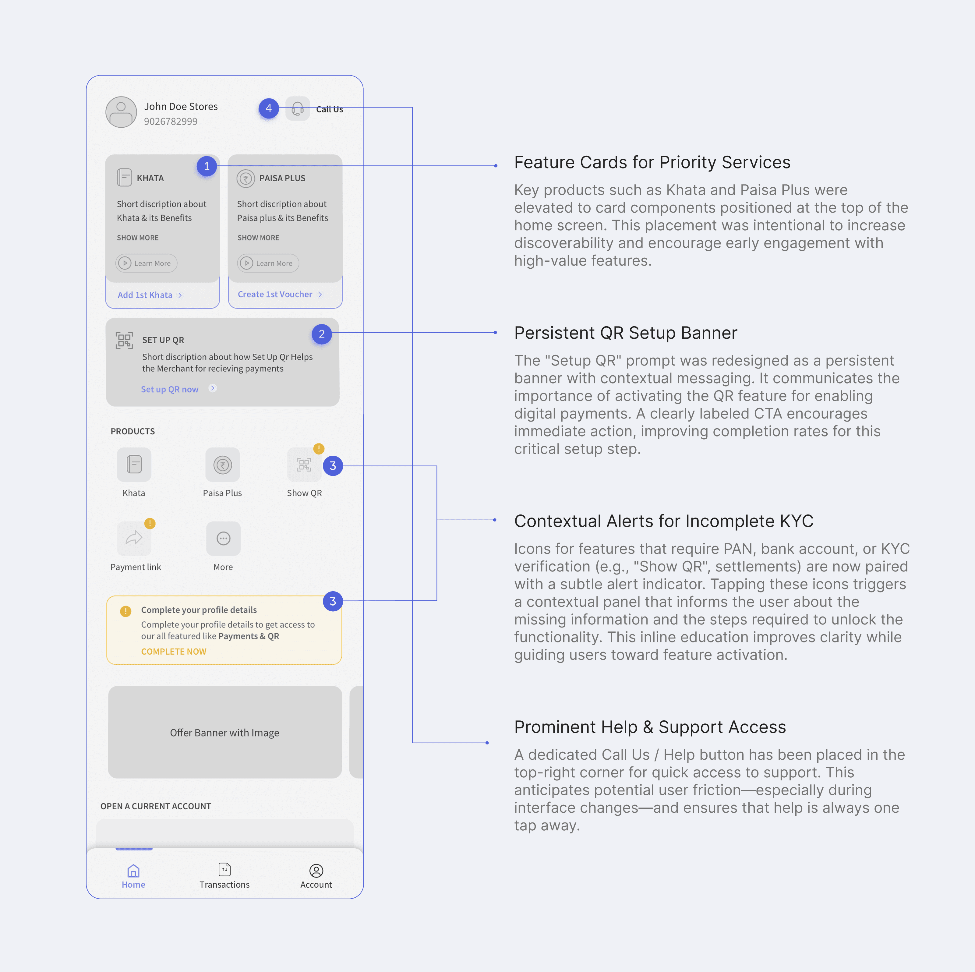
The first wireframes came straight out of that research: Khata and Paisa Plus as cards at the top, a persistent Setup QR banner, an alert on any feature still waiting for PAN or bank details, and Call Us in the top right.
The decisions
Three screens to start
I cut onboarding to three screens. PAN, bank details and KYC are asked for when a merchant first opens a feature that needs them, not before.
QR before anything else
I moved Scan QR to an icon in the top right of every screen, and made Setup QR the first card a new merchant sees, so the step that unlocks the rest of the app is never more than a tap away.
Locked features say why
Anything still waiting on PAN, bank or KYC details carries an alert. Tapping it names exactly what is missing, instead of failing silently.
Discovery that steps aside
Khata and Paisa Plus open as short explainer videos. Once a merchant uses them daily, the video goes and the card shows live numbers instead.
Settlements at the top, with the answer
Transactions and settlements share one tabbed panel at the top, because the latest payment received is what merchants check most. One line beneath it answers the two commonest questions: next settlement at 10 AM tomorrow, without any charges.
Help in reach during the change
I put Call Us top right, with a help screen that answers questions about the redesign itself. A new layout confuses exactly the merchants who knew the old one.
Designing for the counter
Two things are scarce at a busy counter: time to read, and a moment to look.
Readable at arm's length
Inter, chosen for legibility on low-resolution budget Android screens. The
ramp is built up from a 14sp floor, with body at 16sp, and set in sp so it
grows with the text size a merchant has already chosen on their phone.
- ₹5,304
- Amount24sp · Bold
- Settlement figures and balances
- Today's Transactions
- Title18sp · Semi Bold
- Screen and section headings
- Accept money from everyone
- Body16sp · Regular
- Labels, descriptions and buttons
- 38 transactions
- Secondary14sp · Regular
- Metadata and helper text
Heard without looking
Reading still means looking. Paytm's answer was the Soundbox, a speaker on the counter that reads each payment aloud, paid for by subscription. Ours was the same sentence from the phone the merchant already had: no device, no rent, delivered with an app update.
Try it
Press play, then look away.
The merchant never has to look either. Each press is a new payment, read aloud the moment it lands.
Sound on. Spoken by your browser's own voice, so it will not sound exactly like the app.
| A speaker on the counterPaytm Soundbox, 2019 | The phone already thereFreecharge in-app alert | |
|---|---|---|
| What the merchant needs | A separate speaker | The phone already on the counter |
| What it costs them | A monthly subscription | Nothing extra |
| How it reaches them | Delivered one shop at a time | With the next app update |
| When the phone is silenced | Still speaks | Stays quietThe trade-off |
Final design
Progressive disclosure throughout: KYC and bank linking triggered when a feature needs them, and a home screen that changes shape as a merchant matures.

Where it went next
I left Freecharge in March 2022. Six months later, Freecharge and Axis launched loans for small merchants the way we had planned them: eligibility read from a merchant's Freecharge transactions, and repayment taken in small daily amounts from their QR settlements. The settlement panel this redesign put at the top became the rail those loans ran on.
Sources: Play Store reviews, 2019–2022; TechCrunch, March 2021; YourStory, September 2022; Rest of World, April 2023.