
What is a virtual credit card?
A virtual credit card has a card number, expiry date and CVV like any other card. The difference is that it exists only online, inside the bank's or financial institution's website or app.
Why a virtual credit card?
VCCs are the newest entry among online credit tools, alongside debit cards, traditional credit cards, network EMI cards and buy-now-pay-later. The advantages that mattered to our users:
- No annual or renewal fee
- Nothing to carry in your wallet
- Fast online application and approval
- Accepted by every merchant
- Safer against phishing and online fraud
- Offers and reward points similar to physical credit cards
Who are our customers?
People with a fixed monthly income and a good payment history, aged 25–35, already familiar with modern credit tools. They shop frequently on e-commerce sites, where a VCC can be a more rewarding and convenient way to pay.
Personas
George Peter, 22, Bangalore, front-end developer, English and Hindi. A frequent online shopper with a good credit score and moderate history with online financial services. Digitally native and familiar with online payments; hasn't owned a credit card yet; aware of digital fraud and phishing.
Rohan Sharma, 33, Pune, accountant, English, Marathi and Hindi. Fair online purchase frequency, fair credit score, good history with online financial services. Already owns a credit card; concerned about the security of physical cards; wants a card quickly.


User story
George wants to buy a new smartphone on Amazon using debit card EMI, since he doesn't have the full amount. He finds out his debit card isn't eligible for EMI. Later he sees an online ad for the VCC, and is drawn in by instant approval (about five minutes) and the option to convert the whole amount to EMI.
User journey
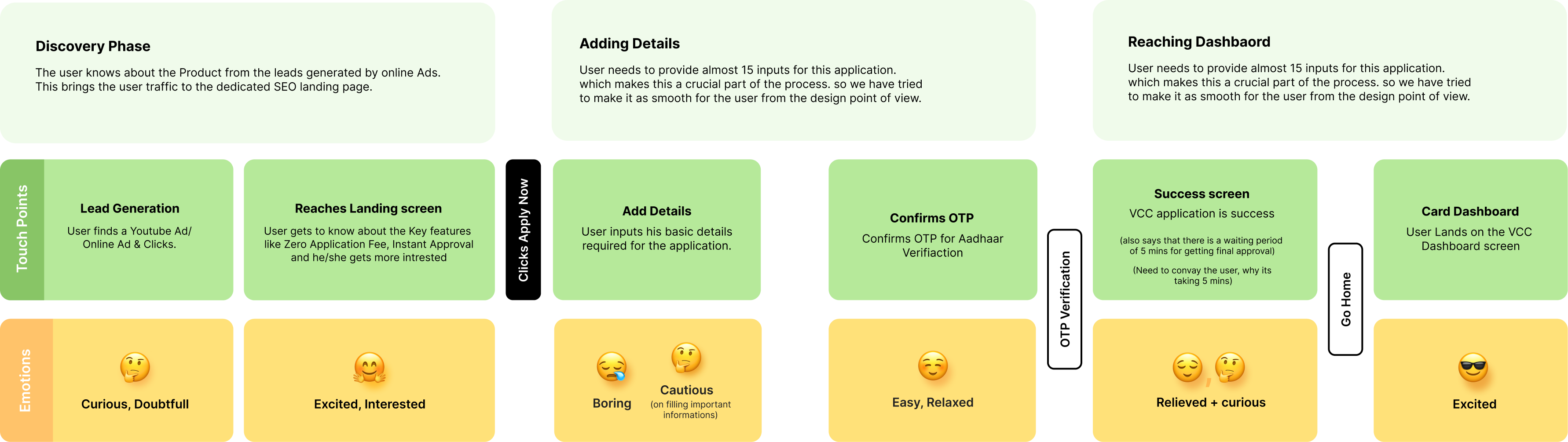
| Stage | Touchpoint | What happens | Emotion |
|---|---|---|---|
| Discovery | Lead generation | Sees a YouTube or online ad and clicks through to the SEO landing page | Curious, doubtful |
| Discovery | Landing screen | Learns about zero application fee and instant approval | Excited, interested |
| Adding details | Add details | Enters the details the application needs (about 15 inputs), the most critical part of the flow | Bored, cautious |
| Adding details | Confirm OTP | Confirms OTP for Aadhaar verification | Easy, relaxed |
| Reaching dashboard | Success screen | Application submitted; told final approval takes about five minutes, which the design needed to explain | Relieved, curious |
| Reaching dashboard | Card dashboard | Lands on the VCC dashboard | Excited |
Wireframes
Nine screens: landing, add details, contact details, personal details, work details, terms and conditions, OTP verification, application success, and the VCC dashboard.
The details worth noting are the small ones. A three-step progress bar so the length of the form is never a surprise. A placeholder for trust marks beside the call to action. And an OTP screen that explains the code can take up to five minutes, asks the user not to leave the page, and shows how many resends remain, because the silence after submitting is where people give up.


Final screens

Feature screen
Introduces the card, highlights the key benefits, and leads to a clear call to action. Three components: the card view, benefit cards, and feature banners (welcome vouchers, annual fee waived on monthly spends above ₹50,000, and the digital plus physical card pairing).

Add details
Filling in details is usually the most time-consuming part of an application, and the place drop-off concentrates. The flow is split into three groups, contact, personal and work, so users stay focused and finish with ease.

Details added
As each section is completed it gets a checkmark, and once all three are done the call to action turns orange and becomes active. Progress you can see is progress you'll finish.

Success and activation
Confirms the application and moves the user straight on to card activation.
Visual design
Source Sans Pro, in Regular 400, Semibold 600 and Bold 700, at 16, 14 and
12px. Text in #222222 and #444444, an accent of #FF7744, on #FFFFFF.
Outcome
The card launched on 27 August 2019, Freecharge's first digital credit card, powered by Axis Bank. A Visa Platinum on a 50-day credit period, issued to invited users from a banner inside an app they already had.

It was never an acquisition funnel
Only pre-qualified users ever saw the banner, so this was not a form competing for strangers. Everyone who reached the first step had already been approved. That changes what the design is for: not persuasion, but completion. It is why the flow opens on the benefits rather than the eligibility criteria, and why the three groups of details sit in one screen that can be worked through in any order instead of a linear gate.
The handoff was the hard part
Everything before approval lived in Freecharge, and most of what came after it did not.
- In FreechargeDesigned here
- The invite banner
- The application, in three groups of details
- Terms and OTP verification
- Approval, and the card itself
- Checkout, as a saved payment method
- In the Axis Bank appHanded over
- Available credit limit
- Reward points
- View card details
- Repayment, and the minimum due
- Cancellation
- Transaction alerts, by SMS and email
So the job was to carry someone confidently to a card and then hand them over without it feeling like being dropped. That constraint shaped the success screen more than anything else: it had to close the application and open the next thing in the same breath.
The pattern outlasted the project
Axis later added a higher tier, the Freecharge Plus card, on the same model: invite only, issued virtually from a banner in the Freecharge app, and used with an OTP rather than a PIN. That is still how both cards are onboarded today.